Musecomm
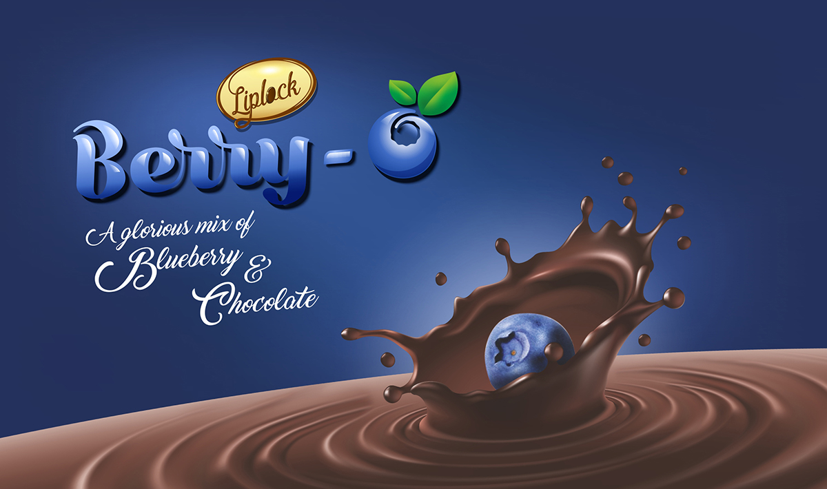
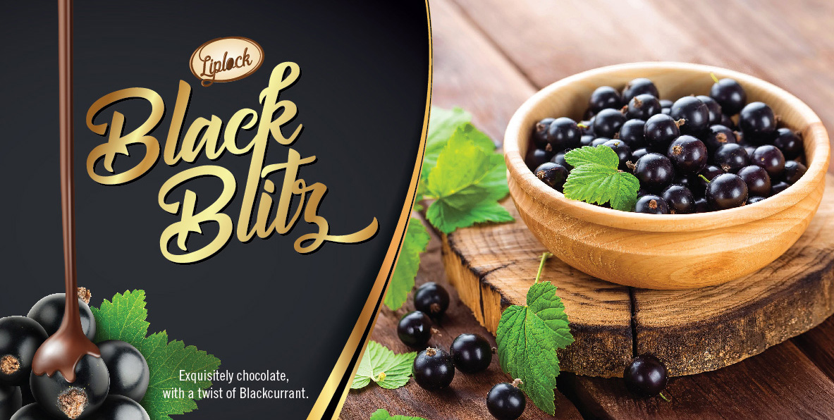
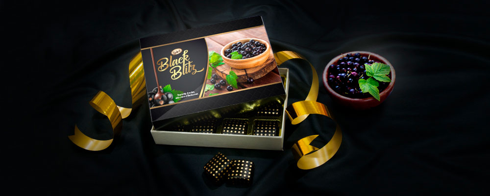
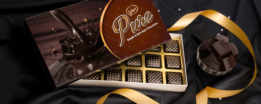
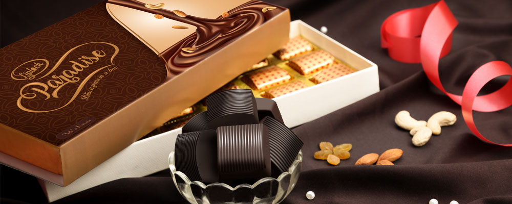
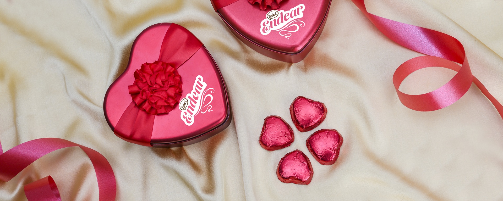
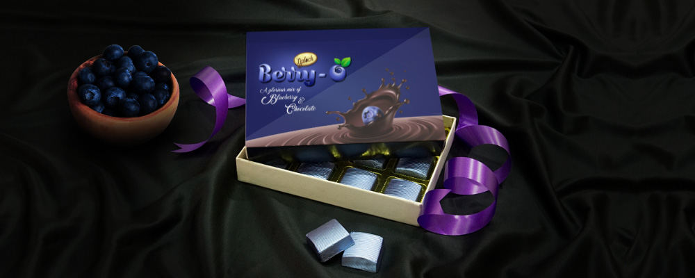
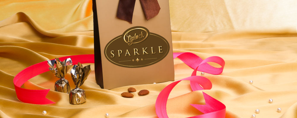
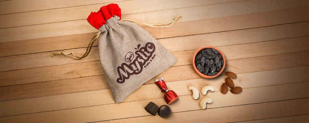
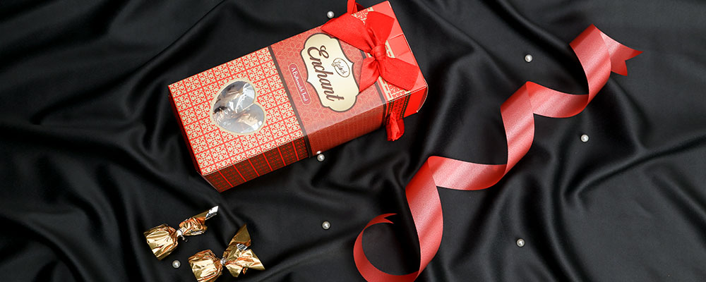
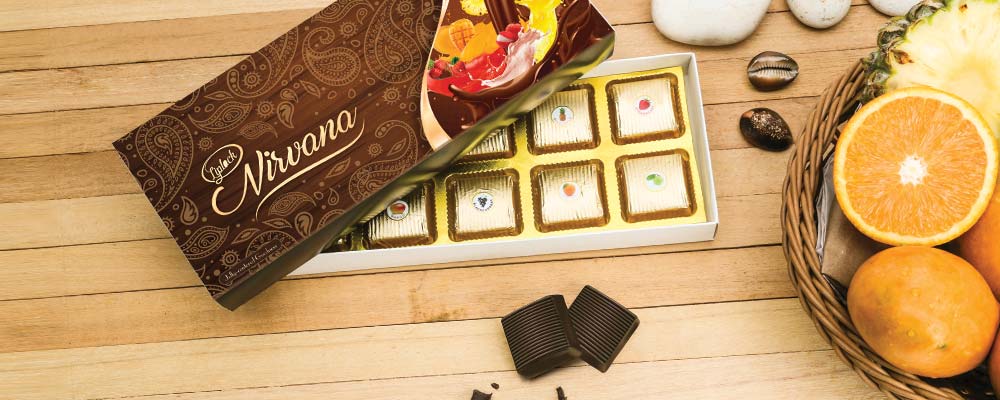
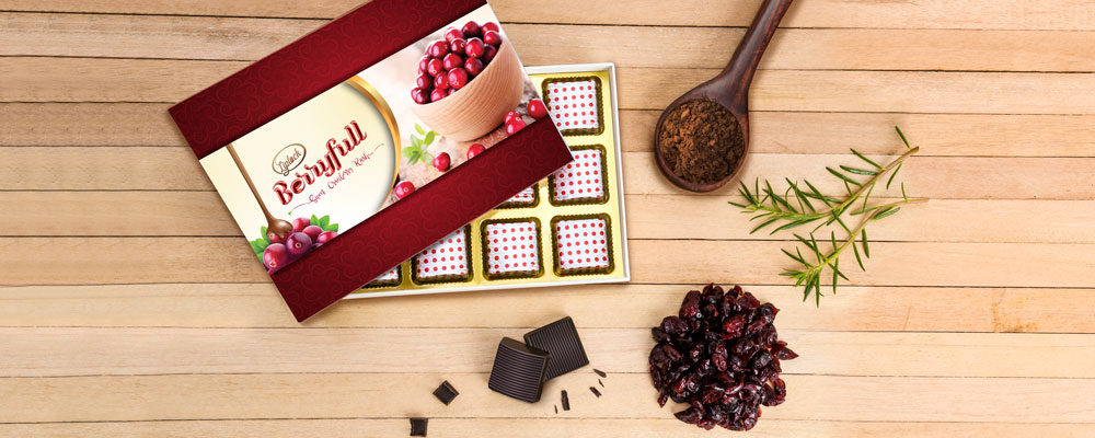
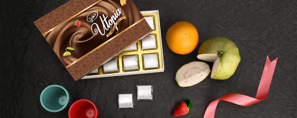
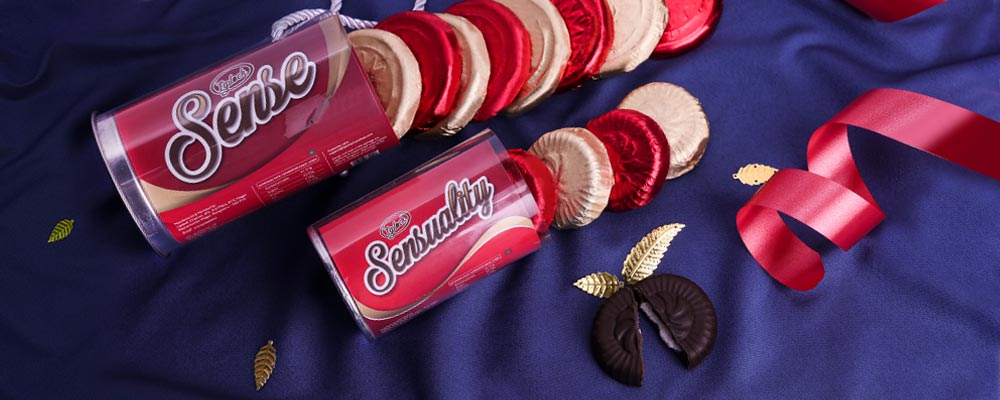
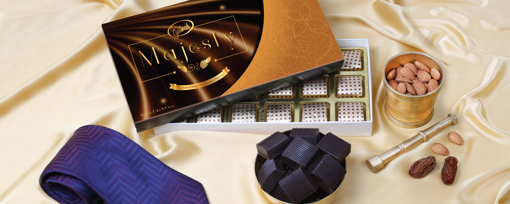
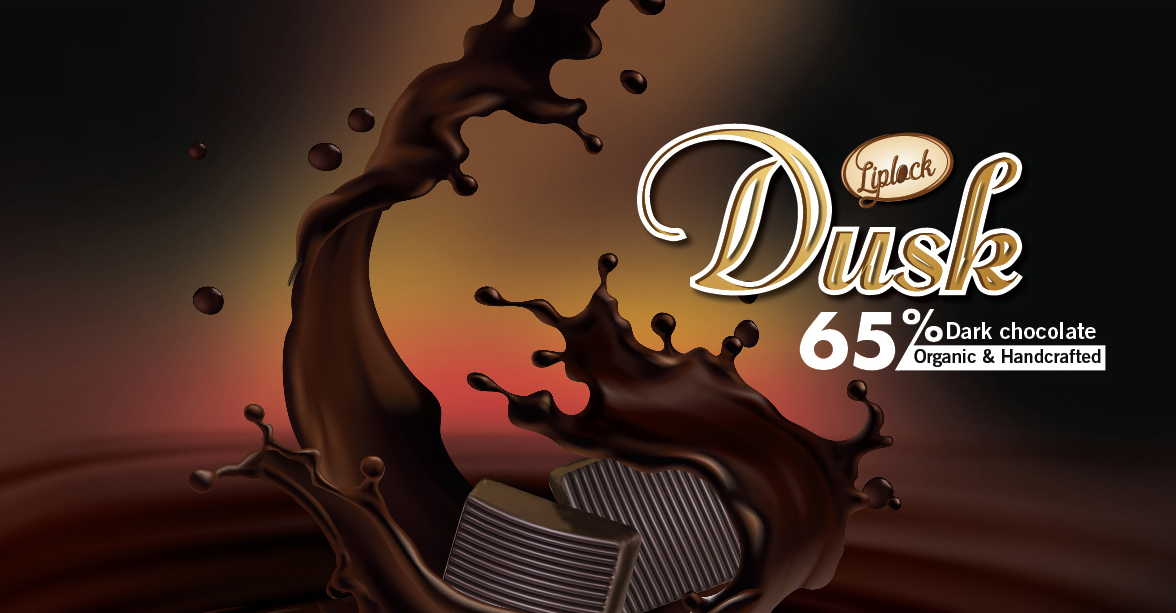
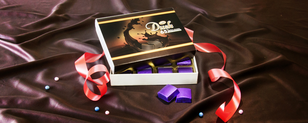
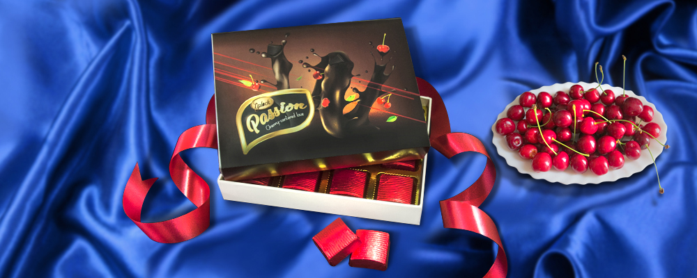
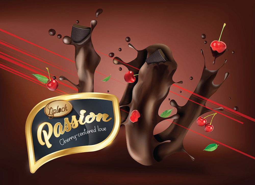
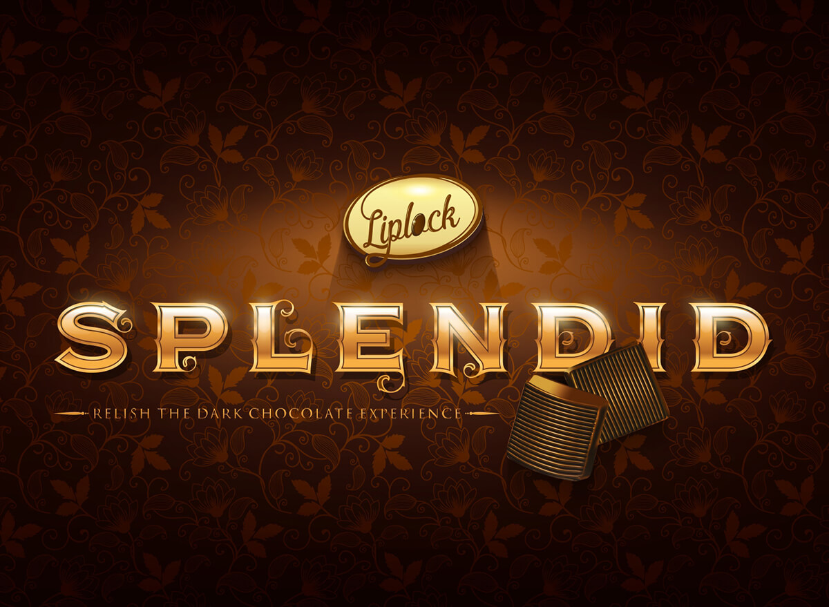
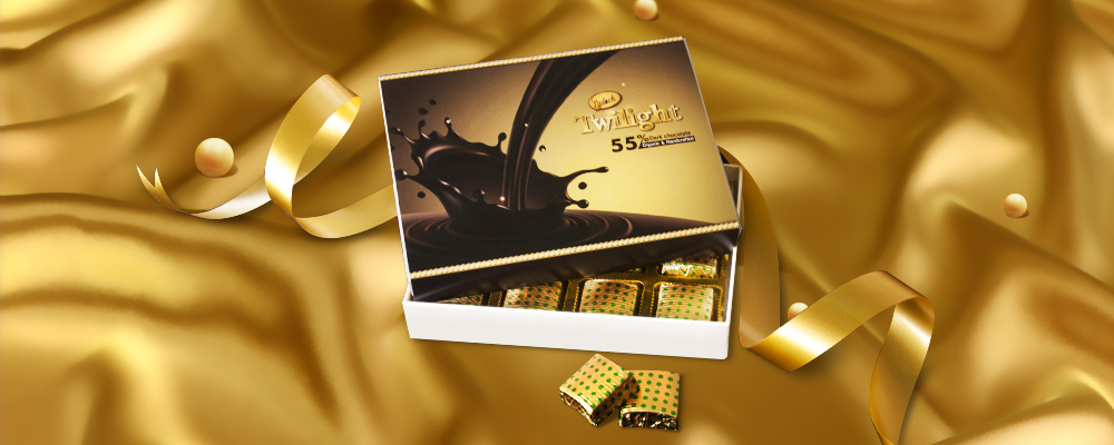
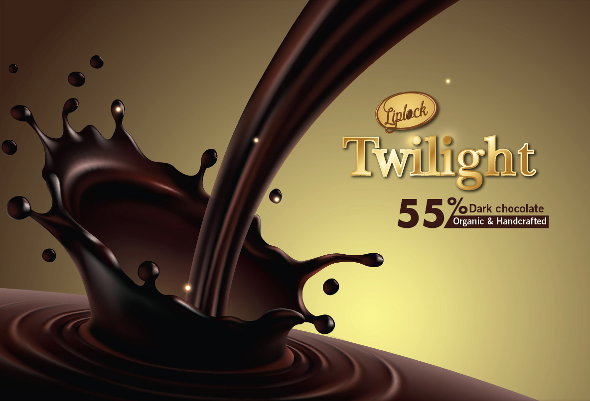
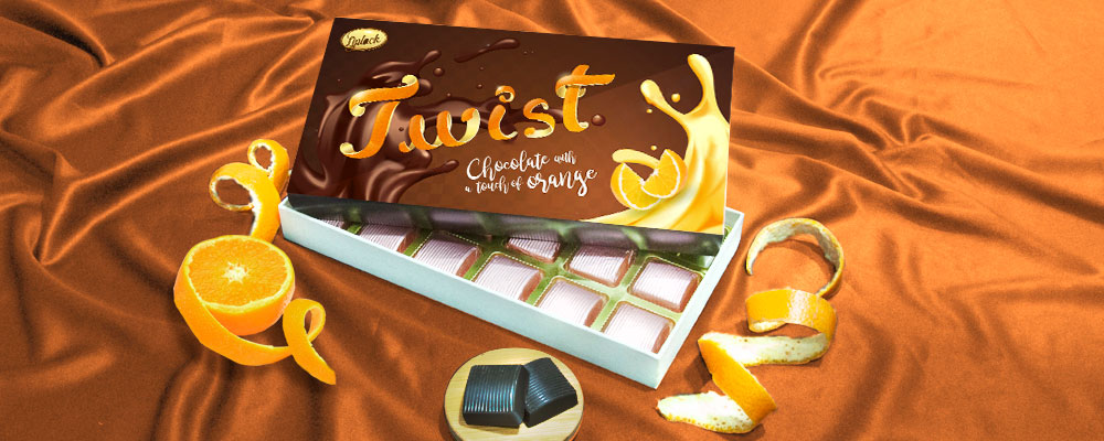
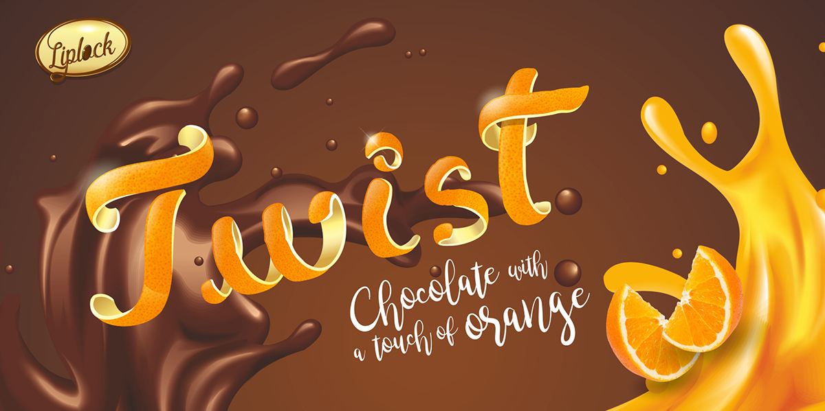
Liplock Chocolates Packaging Design

A little eye
candy
to go a
long way

Liplock, a gourmet chocolate brand built for direct-to-home delivery, was looking for fresh packaging. As they grew, their packaging needed to do more than protect what was inside. Online, it had to slow the scroll, tempt the eye, and make choosing feel easy. For a brand built on first impressions, the pack had to carry the experience.

What we
set out to do

Chocolate is an emotional purchase, and packaging often makes the decision before taste ever does. For three of Liplock’s signature products, the goal was simple.

Let the packaging speak for itself and make the choice feel irresistible.

How we went
about it

This wasn’t a category for a one-size-fits-all design. We looked closely at each product, right down to its ingredients, and built a visual language around what made it special. Twirls of orange, splashes of chocolate, berries drawn from the logo, and rich, expressive colors came together to create distinct identities within one brand family.

Typography and color were just the starting point. The real work was shaping a look that felt indulgent, playful, and instantly recognizable.

What it led to

People noticed. Each pack told its own story — Splendid (dark chocolate), Twist (chocolate with an orange peel), Berry-o (a berry-filled chocolate), and so on, without the need for explanation.

Even in a crowded digital space, the packaging stood out and left a strong, memorable impression.

Recognition
along the way

Award for Design Excellence –

Big Bang Awards

Touchbase